 |
| This is my initial idea, the feedback I got for it was that it was a very creative idea but it would suit a much more established artist. One of the criticisms was that it was hard to make out the artists face, and since this is the debut album that would be a bad thing because the artist needs to be instantly recognised. I will need to fix my album cover idea to fix this and I need to keep in mind that the artist must be recognisable. |
Thursday 20 December 2012
My Digipack update
Wednesday 19 December 2012
More Photoshop experimenting
Because I want to cover my artists face in graffiti for the digipack, I thought it would be a good idea to experiment a bit more on photoshop as covering a face would be a difficult task. I used lots of different filters until I got the effect I was looking for.
This was the result of my first attempt.
Here is the result of my second attempt.
After playing with Photoshop for a bit, I realised the effect would look better depending on the artwork I chose to cover the photos face in, so for my final product I am going to have to pick artwork which has lots of colour so it doesnt look translucent.
This was the result of my first attempt.
 |
| this was the original image. |
 |
| this was the image after I went on photoshop, the paint on the face was too transparent. |
 |
| Here is the original image. |
 |
| Here is the image after manipulation, The paint looks more opaque than the first one. |
Tuesday 18 December 2012
album cover mock up
 |
| Here is the front and back of the cover I would like to design, because our genre is alternate hip hop I thought itd be best to do something different so I'm going to attempt to cover my artists face in graffiti. The cover also carries several references to the music video we produced such as the location and the artwork. The feedback I got from Dan was to make sure the albums name stands out a bit more. |
 |
| The same theme carries on inside, with the same references to our music video, only there will be a different photo of our artist who will still be covered in graffiti. |
digipak Group Design Ideas
We have decided that all our individual designs should have a colour scheme of black, white ,green and colours that are dominant in the music video so we could establish a link between the video and the digipack. As a group we have decided to call the album IVXX. We have also decided to make a 4 panelled digipak.
The fonts we will be using are:
The fonts we will be using are:
 |
| Urban Jungle |
 |
| Bright young things |
Friday 14 December 2012


digipak cover ideas progression
I decided to draw a few concept ideas to use for my front cover of the digipak.
The first idea was to have the words IVXX scrawled over the face of the artist on a plain background but I decided not to do it because there wasn't a clear enough link between the digipak and the music video we had produced.
The second idea I decided to include a forest in the background as a reference to the music video.
In the end I decided to integrate both backgrounds into the picture and cover the artists face in graffiti with a forest in the background. I did this because I wanted to establish a link between the music video and it would've helped to attract the target audience because our target audience like stuff that is a different to others and stuff that is unique.
The first idea was to have the words IVXX scrawled over the face of the artist on a plain background but I decided not to do it because there wasn't a clear enough link between the digipak and the music video we had produced.
 |
| 1st concept. |
 |
| 2nd concept |
I also thought it'd be a good idea to try the same design in another location in the music so I decided to included a wall covered in graffiti in the background of the 3rd picture.
 |
| 3rd concept |
 |
| 4th concept. |
Photos i plan to use


gif maker
- The first image of our artist which is black and white i plan to use in the inside of my digipak. I chose to use this image because i believe it gives a nice effect and is well suited for the inside and it is not too complicated. i also think it is appealing.
- The second is of our artist standing in the forest with him looking in a different direction. This image is used to establish the artist and tell the audience this is our artist and to appeal to our audience which is you younger.
- The last image i plan to use on the back cover of the digipak, i think it would be good to use in the back because it would seem more suitable out of all the photos i have taken.
All these photos i have chosen will be edited and changed to make them stand out more and more appealing to the audience.
Shortlist
shortlist for digipak
For the production of our digipaks we plan to use two fonts. The fonts we are going to use are 'Urban Jungle' and 'Bright Young Thing'. We chose these fonts because we believed they were some of the best to use and also would be well suited to our genre of music and our artist. The 'Urban Jungle' was a good font to use because the font had building and sky scrapers within it so it gave a urban feel to the digipaks. We used 'Bright Young Things' because we liked the font style and thought it would suit the digipak idea we had. The colours that would be used in our digipak idea were black, white, green and blue.
We agreed on these colours because we all had different ideas for the digipak and wanted to use colours which most of us were comfortable with and thought would be appealing to the audience.
 urban jungle
.jpg) bright young things
bright young thingsThursday 13 December 2012
magazine advert analysis
The first magazine advert I will be analysing is an advertisement for Rage Against the Machines anniversary album, the magazine consists of a black ground and a picture of their album cover, this reflects the type of music they make because they want to make a statement in the music they produce and it is also good at attracting attention because the album cover shows a monk being burned which would catch anyone's eye. The writing on the magazine advert is also good at attracting attention because its written in big white letters and it is easy to read. It follows the genre conventions of political rock because it contains an image referring to a major incident in this case a protesting monk, most political rock albums would usually contain a reference to something major.
 The second advert is an advertisement for the Savage heart. This advert doesn't include a shot of the album, instead it uses the same photo used in the album cover, this helps to make the album more recognisable because if the audience see the album in the shop, they'll think back to the advert if they have seen it. There are also a couple of reviews which would help attract an audience. The colours of the fonts are written in different colours so its easier to read so the audience can remember what was written on the advert.


The 3rd advert is an advertisement for a musical rendition of War of the Worlds. It includes pictures of aliens on the album. The advert places a lot of emphasis on the New generation/interpretation, using it as a unique selling point in order to attract a new audience. The names of the artists included in the album are written below the tag line, this helps the audience identify who is the track. The advert follows the same colour scheme as the album, this helps the audience identify a link more clearly.

Digipak analysis
The first digipak I will be analysing is The best of 2pac - part 2:Life. It is in the hip hop genre and the outside panels are black and white. The album is paying tribute to 2pac and the colours black and white are used as a sign of respect for the late rapper. The font used for the title of the album is in bold and it stands out which could reflect the contents of the album. The image used on the front cover is effective in attracting an audience because it shows Tupac in a respectful pose which stands out from the usual hip hop albums where there is usually a rapper with diamonds on his/her teeth posing next to a car. The back of the album is more or less similar to the front. Overall the outside panels are very effective in paying tribute to Tupac by keeping the album looking simplistic and not making it look over the top.
The inside panels of the digipak continues with the black and white colour scheme. The inside consists of a panel which holds the CD information about each song and a letter from the mother of Tupac thanking the customer for buying the album.
The next album I will be looking at is a compilation album with songs from various artists called Nuggets. The outside panel has a white background but the foreground is dominated with a whole range of different colours and patterns. This reflects on the different styles of the different artist included in the album. The font used for the title stands out because its the brightest thing on the cover and is quite big which is good for leaving an impression on who ever is looking at the album.
 |
| Outside Panel |
 |
| inside panel, some words from Afeni Shakur. |
 |
| Outside panel |
The inside panels of the digipak has a more consistent colour scheme as it is mainly yellow, the same colour as the title of the album. There are lots of images of records all on top of each other which reflects the album being a compilation. The inside goes into more detail of the tracks included.
 |
| inside panels |
The 3rd digipak I will be looking at is Delays, the outside panels consist of the same gold circle with a red background, the front cover consists of a wing with stars and the back cover consists of the track listing in the gold circle.
 |
| outside panels |
The inside of the digipak has almost the opposite colour scheme to the outside, it contains a black circle surrounded by red leaves, with a gold star and another golden image, this suggests that there is more to the album than meets the eye.
 |
| inside panels |
Looking at Digipaks

The top digipak is from Tupac. The front cover follows the colour scheme and the idea of having an image of Tupac, on the three different panels. The colour scheme which is black and white is also used with he font. the Front panel shows a large image of him and the title of the digipak to the side of the panel. Then the middle panel has an image of Tupac with the song titles. The far left panel shows an image of Tupac in a frame with a note written by his mother, thanking the people who helped make the album.
The bottom right digipak is from a compilation digipak. It has a more vibrant cover with more colour. The left panel shows the song titles on the CD.
The bottom right digipak is from the Delays. It has a constant image of a circle on both panels and colour scheme. The colours gold, red and black are used. The left panel shows the song titles while the front cover shows and image of a wing.

The top digipak follows the colour scheme with the black and white. Its minimalistic and is good in that way as it is not too complicated. the same with the CD a black cover with white font.
The bottom left shows and image of records all mixxed and which goes with the idea of a compliation CD. The colour scheme is also followed the font of the album name is used for the inside cover. The inside text shows the album name and information on the tracks.
Lastly, the album by the Delays shows a red circle which is used and black within the circle and gold image. It follows the scheme and is shown well.
Digipak Analysis
I have been looking at more digipaks for help and guidance in what i should be doing. One i think is very interesting is, Kanye West's 'Graduation' digipak.

The front of the digipak shows an image of a bear wearing clothes associate with a hip-hop artist or college student. The image has many different colours but stand out well and will catch and audiences attention. The album name and artist name is on a sticker at the top of the album which can be removed, which shows that the people behind the digipak were not concerned that the album name and artist was not printed directly onto the digipak. The last detail is the 'Parental advisory' logo at the bottom left.


Even though this may seem very minimal it is done well. The art is produced well and placed in the right places on the 2 panel digipak. It seems as if the artist wants his audience to stick this on their wall or place it on a table to enjoy the art on the digipak as also the music which is a good selling point as it makes them a collectible item and interesting for the audience.

The front of the digipak shows an image of a bear wearing clothes associate with a hip-hop artist or college student. The image has many different colours but stand out well and will catch and audiences attention. The album name and artist name is on a sticker at the top of the album which can be removed, which shows that the people behind the digipak were not concerned that the album name and artist was not printed directly onto the digipak. The last detail is the 'Parental advisory' logo at the bottom left.

When you open the digipak, the theme of the artistic pictures carries on with the bear in graduation attire and is basically graduating from college. This connects well with the name of the digipak. There is no other information on the digipak but it is still beautifully crafted and the art well chosen. It is kept constant with the graduation theme not confusing or ruing the digipak.

Lastly the back of the digipak. This has the same image from the front cover back seen from a different angle. On the left side of the digipak there is copyright information, it says the main people who helped make the album and other copyright information. lastly the is a barcode along the black strip.
Even though this may seem very minimal it is done well. The art is produced well and placed in the right places on the 2 panel digipak. It seems as if the artist wants his audience to stick this on their wall or place it on a table to enjoy the art on the digipak as also the music which is a good selling point as it makes them a collectible item and interesting for the audience.
Experimental Product

In the lesson we explored the photoshop features and learnt to use the software. I learnt how to use the different tools on photoshop and how to lay the images so you can make something close to a digipak. I found it difficult at the start to get used to it but then soon found it familiar, i started to look for pictures for my own digipak and how i would construct it.
If i worked harder my experimental Digipak may have been of better quality but during the lesson we just had fun with the software and got used to the tools.
Friday 7 December 2012
Audience Feedback
The feedback i got from friends from facebook.

It was not as in depth as i would have hoped but it was still great having somebody thing the work you have done is good.

It was not as in depth as i would have hoped but it was still great having somebody thing the work you have done is good.
Thursday 6 December 2012

experimenting with photoshop.
In todays lesson, we started to play around with photoshop, in order to get used to the programme so it would be easier for us to produce our own cover and advertisement.


I used a lot of layers to produce this and I followed the genre conventions of a hip hop song using pictures of my media teacher Dan. It was a fun process and it also made me learn alot about photoshop.
starting on Digipaks
Today we used Photoshop to start learning how to use all the tools so we can create a digipak to a professional standard.
what I have not done is included the name on the spine of the digipak, and the copyright information which is written at the back of the cover.
 |
| here I am experimenting with different effects or filters that I can use on images |
 |
| I have added a filter on the image and have included the track list at the panel which is the back of the digipak and also used an image of the street. |
 |
| Now I have enlarged the photo of the artist to an appropriate size and included the name of the album as well as the name of the artist. It is important to use two fonts which make it look a lot more professional and simplistic. I also have stuck to a common colour scheme which is black, grey, white and lilac which are all subtle colours which I think fits well with the Artists image and genre of music. |
 |
| This is the completed version of my Digipak task. I have used a barcode and the name of the record label. |
Final cut
The final cut of our music video I think is really good, I'm very happy with how to came out but one thing I think we need to work on are the transitions in the video. I think we created a music video that reflects in what we had originally thought of.
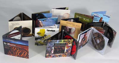
Digipaks

The Digipak is a similar to an album but is made out of paper or cardboard and has four panels or six. In class we talked about why digipaks were used and useful in getting interest in music. The art work also being another important factor on a digipak. The digipaks today are a new modern way of selling and packaging cd's. It helps artists design their own album. They are common to keeping the designs in digipaks constant using the same font.
Skills development
In A2 I have learnt many different techniques.
- To use Finalcut more effectively
- learning a different way to edit
- filming more footage
Wednesday 5 December 2012
Functions of a digipak
Digipaks are a modern approach to packaging CD's. They usually contain more than 2 panels which has whatever the artist/record label has decided to put there and the usual place where the CD usually is.They are often used for special editions of CD's. Digipaks can provide more information about the artist and they can also add value to the artists material because it would be giving the audience more than just music, it provides the audience with a different outlook on the artist.
Digipaks have a consistent design scheme so the colour scheme and the font used on a digipaks would be the same throughout the entire package.

Digipaks have a consistent design scheme so the colour scheme and the font used on a digipaks would be the same throughout the entire package.
Subscribe to:
Posts (Atom)