Q1. In what ways does your media product use, develop or challenge forms and conventions of real media products?
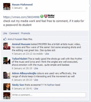
Music videos are created to promote the release of a new track and to also promote the artist. The music videos are shown on popular music channels such as MTV, VH1 and Kerrang it is a platform for the artist to stay in the public eye for a longer time after the track is released. Our artist is a local student who was looking to make a music video to promote his music and having a music video helped him to reach out to his niche audience by uploading the video onto YouTube.
Carol Vernallis pointed out that the majority of music videos are edited to a rhythmic basis which is when the shots change in time with the beat, the edits become more obvious. When we started the process of editing we listened to the track and made markers at every beat to help us determine when each shot should changed.
Here you can see the green bar is the whole song on the time line, and the red dots are the marker to show when we should change to the next track.
Vernallis also commented on how music video makers defy the concept of continuity regarding the artists costume, setting and movement. This is don to create excitement and to interest the audience. However in our music challenges Veernallis’ view on continuity and we keep to in terms of transitioning to a new location and the artists costume. He wore the same jacket/hoody and backpack but changed his shirts.
Most music video makers film base tracks which is a clip of the whole track lip sung by the artist to make sure the they are in time with the music and it is and easier process when editing. We shot lots of base tracks and synchronised them to the song with more markers and layered them on top of each other and cut to the markers.
Links
Music video I researched on from the same genre Lecs Luther – Dia Dhuit who has influenced they we way we have shot our music video. This artist is from the same genre of alternative urban rap, and Lecs Luther’s music video has influenced me when preparing for the making of our music video because we liked the style editing and shots. The video is disjunctured where the video has little or no relation to the lyrics of the song. Like this video we created a music video that does not depict a story to the lyrics of song. We had a sequence of base tracks filmed in different locations such as Brick Lane, Camden Town and Hampstead Heath Park. They were all shot with a variation of angles and shot types.
We also really liked that the director of this video used fish eye on some shots, which emphasised the genre and style of the artist. But unfortunately we did not use this concept because we did not have the correct lens to film in fish eye. Instead we used a special effect. We also used lots of close up shots to establish the artists, one of our base tracks is a extreme close up of the artists lips rapping to the song.
extreme close up
not fish eye effect but blur tool
example of fish eye used
In our music video our main motif is street art and scene shots of greenery at Hampstead Heath Park. Like Kings of Leon’s music video of Use Somebody they had a motif of shots of city sky scrapers shot from a very high angle maybe by a helicopter, they also slowed down some footage and you could see the streaks of the fast lighting in the traffic which is really effective and unusual against the dark scene.
These are scene shots of the motifs for my music video.
We also considered Goodwin’s theory on making the costume and setting relevant to the video as the artist is both the narrator and the character in the music video and had to plan and build the video considering how our ideas may be relevant to the music and genre. The theme of our chosen song was mellow and poetic and lyrically the track was abstract and required thinking as he mentioned a lot of political points. So we thought about how we could blend his image to match the locations. The artist is urban and British based, and so we chose to film at Camden Town, Brick Lane and Hampstead heath.
All locations that his niche audience would be familiar with and could relate to.
Interestingly our music video does not follow Goodwin’s view on music video building to a climax and then fades at the end. Our video did not need a climax and so we kept it in time with the steady beat of the song.
How conventional is my digipak and advert?
outer panels
My design has followed a lot of the conventional rules in terms of positioning. My front cover has an establishing shot of the artist and a gradient fade from the bottom to the top. The name of the artist is placed at the top so it stands out and is the first thing some will look at the artists name. The back has followed the convention of placing the bar code at the right hand corner and the copyright and record label information next to it in small print. I have included the logo for the independent record label and placed the track list on the top left hand corner. Th font size for the track list is unusually large but I have done this on purpose to make the text stand out against the busy background.
inner panels
I have kept with the whole theme of shadow and darkness and kept the background plain black and made the CD more of an statement against the simplicity of the background. I used black for the background and the filter effect on the picture on the CD to create continuity and to show that my inner panels where reflecting the theme on the outside.
Advert
With this advert I followed most of the conventions of having the album big and bold that stands out the most. But what I have failed to do as project the artists name in that same way so we could establish the artist better.
To sum up in many ways I beleive that I have followed most of theconventions based around the production of a music video, however I have followed the conventions of the way real media designers position titles and information for the digipak but I hsve not used promotional stickers, messages or note on the album cover.
How effective is the combination of your main product and the ancillary texts?
The links between our music video and ancillary are made clear to the audience and in can be seen in the similarities in the work. The use of our camera work in both products and music video is seen through the same use of shots and incorporating them into my digipak and poster.
When I used the same shot from the music video for the digipak I wanted the audience to be familiar with it and to make sure the link was obvious to the audience.
The theme and mood for our music video was to create a video where it didn't follow the forms and conventions. I wanted this to be obvious because of the locations we used and the mood this helped to create. We used scenes in parks and forests to show that our artist is unique and doesn't only belong in an urban area. This is linked with the mise en scene, we used locations which we thought best represented our artist, for example:
I also incorporated brushes into my digipak to create a more professional look and to make it more appealing to the audience. The brush i used was for the inside of my digipak and poster.
In the digipak I used a plant brush which i also used in the poster, I also kept the colour the same. I wanted to make sure that our product was constant in its design and themes and that's why I used the same brush. I used a plant brush because of the heavy influence the outdoors had on our music video and I hoped to also make sure that it was also constant.
The fonts I also kept constant, I used 'bright young things' and 'urban jungle'. I also used the same colours, I did this so it would be recognisable and that our artist and work is also easily identifiable and that the connections between the different products and Music video were obvious.
The motif for our music video was the Hannibal mask. We chose this because of the influence MF DOOM, has on the artist and the idea that many people wear masks daily and that theirs is just invisible. In hindsight i would have liked to put the Hannibal mask on mu poster and digipak and i think it was important.
Our Audience is most likely young adults into conscious hip hop. They are students or new workers who may have a higher education and have a unique fashion sense. I now think our audience would be predominantly male with a few female fans. The reason i have this image of our artist is because i think that most of his fans would relate in the way he thinks and dresses.
I think we would attract our audience through the places where we place our posters for our digipak and the design. Where we place our artist such as magazines and youtube adverts help to create the need and desire to own his music. I tried to create a digipak which was unique and would be appealing to his audience hoping that it would attract buyers. Our artist would prodomently be on MTV and online. We would put up streams of the album on sound cloud and try to get youtube music critics to listen and promote his work.
We would also advertise his work on Facebook and Twitter trying to publicise his work more.
All of these chosen shots are all from the music video which provide continuity and familiarity between the music video and the artist. The song is mellow and poetic and I thought that my shortlist reflects the genre of alternative rap and the mood of the track.
long shot of the artist in serene background of greenery and a lake
long shot of artist - potentaial front shot
potential inner panel photo
interesting shot and background
low angle shot, outline of artists face
scene shot where we filmed some of the basetracks
scene shot
shot of branches
this is a really interesting shot because like the name the artist is wandering and you could bearly see him which provides ambiguity and interest the audience
How effective is the combination of your main product and ancillary products?
The purpose of creating a music video, digipak and an advert is to sell the album, another purpose is to establish the artist, and creating visual links between each of the products increases the exposure of the artist. The music video adds an extra dimension to the song, which would boost interest levels in the material the artist produces, and the ancillary products help to get the name + image across.
In my opinion, I think the combination of the music video and my ancillary products are very effective because there is a clear visual link between the two.
The artist is featured on all the products which shows that they are all linked together. It also makes the artist one of the key selling points of this album because his image is everywhere and that would help put him over with the target audience.
One of the factors that helps establish a visual link is the camera work, the most dominant shot type in our music video is the medium close up, and the images I chose to use on both the advert and the digipak feature a medium close up of our artist, this helps to establish a clear link between the two products and it would make the image of the artist more memorable. However I adjusted the contrast of the photo for the digipak which gives it a different effect to the shot in the video.
Here is one of the medium close ups of the artist in the music video.
Here is the shot of the artist on the digipak
Another factor which helped to make a link between the video and the ancillary products was the costume and hair, our artist has a unique style as he wears brightly coloured shirts,usually wears a coat, wears glasses and he has a hi-top hair cut. This uniqueness means that our artist will leave an impression so we used his style in the music video and we carried it onto the ancillary products, thus effectively killing two birds with one stone as it helped to establish a visual link and the costume and hair will leave an impression on who ever is viewing the products.
The locations in both products also show a visual link between the video and ancillary products as in the music video, one of the key locations is a forest, and in the background of the digipak also features a forest, This establishes a link between the two because the digipak emphasises the importance of the forest in the music video. This means the audience will see the visible connection between the two products.
Here are a few shots in the forest.
the digipak
In both ancillary products, I kept the fonts the same because in real products, they keep the fonts consistent between two products, as well as that, keeping the fonts consistent between the two products ensures that the two can be visually related to one another. I also kept the colour scheme of the fonts the same.
All these factors combined help create an effective brand image for our artist, which would help attract our target audience. Our target audience are 17-25 year old of all genders who like alternative styles of music , the music video would appeal to our target audience because there are many features of the music video that go against the conventions of a mainstream video and that combined with the unique sound of our artist would attract our target audience. The ancillary products would help attract our target audience because it includes free content and it also has a QR code which our target audience is likely to use because they are likely to own smartphones that enable them to scan those codes. The magazine advert is likely attract a bigger audience than our target audience because the advert features quotes from a well known mainstream producer, Pharrell Williams, the bigger audience would see his comment and that would help gather interest in the artist and the album because Pharrell Williams is quite a big figure in the music industry.
Our target audience is likely to encounter our product on social networking sites such as Facebook and tumblr because our target audience uses those sites frequently and the song could be shared on the sites.The advert would be featured in magazines that would usually focus on independent music.
Here is a prezi that contains a bit more info about visual links.
These are the artists I have chosen for my advert research. Most are British based urban artist/bands who are similar to the Annoying Wanderer. All have bold font that jumps out of the posters to establish the artist's name and the name is placed at the top of the poster. The designers choose a common theme of black in these posters to show the name and a striking unusual font which is graffiti – esque style. The background is bright and follows a colour scheme of 2-3 colours always, many have also included the band or artists photo but this aspect is optional. Jay Z’s poster does not include a photo but the image he has used on his album cover. Many posters consists of the artists tour dates and date of release.
need to think about positioning of images and other items on the A4 sized frame
CD Cover
advert cover
The Advert and the Cd cover both stuck with the concept of continuity, keeping with the colour scheme of white and grey. They even used the same picture in the advert so the audience and fans can instantly recognise and identify the audience.
When we were discussing and learning on how to create our digipak we were given tips on do's and don'ts that we will need to consider when planning our ancillary products so that we have an end product that looks professional and realistic in order to achieve high marks.
Do's
use clear and an appropriate sized font
use photos that are in focus because if you don't the end product will look childlike and un-professional.
follow genre and make sure that it is reflected on the digipak
make sure that you use appropriate logos
Don'ts
use effects only to enhance images and use them appropriately. if you do use them make sure they too reflect the artists style and genre of music.
do not overlap text with photo images of the artist face because if they are on the cover it is important for the audience to clearly see the artists face in order to identify them.
A digipak is made out of cardboard with either 2-4 panels on the inside with may be separate pictureson each panel or a background spread across all of the panels, and they may or may not include messages or special thank you notes. Like the one show above Katy Perry's difipak also includes a booklet which gives fans access to more information about the artist. A digipak encourages people to buy albums as it adds value to music and a personal relationship between the audience and the artist.
The outside of a Digipak
the artists name
name or title of the album
production stamp or promotional sticker (thisis optional)
may also inlude notes
track list on the back
barcode
website address
price (optional)
product info
copyright year
logo of the record label and name
The example shown of The Scripts digipak below shows most of the things listed above.
Conventions for Digipaks
use a up to 2-3 fonts
has a consistant colour scheme which maybe 3-4 colours
The next process was to create a digipak and advertisement for the release of the new track.CD covers allow the artist a platform to project their image and creativity visually. The CD covers tell the audience a bit more about the artist’s style and could hint at the genre of music. For instance Rihanna’s new album CD cover ‘Unapologetic’ shows a topless image of the artist bearing all with tattoos and graffiti all over the picture. She uses a minimum of 3-4 colours and we see that maybe she is promiscuous and boisterous and simply doesn’t care bearing for all to see. She is revealing herself stripping off to reach the audience in a different way. The CD cover will be featured in adverts; iTunes cover flow, and as the actual cover of the CD.
Collectors may buy deluxe versions of an album which may include more on the CD and reveal more photos or messages on the inside of the Digipak. Digipaks allows the artist to reach out to their audience in a closer way where they may reveal messages inside etc. For example Katy Perry had her CD’s scented with her perfume as marketing strategy to boost her sales it is also done so her fans may also purchase the perfume as well.
This year’s editing process was much more controlled and difficult compared to the level of filming and preparing we have done for last year’s thriller film opening. Firstly we had to plan a shot by shot to pick one artist and working in a team we had to make compromises and work together in order for us to make the whole pre-production process a lot easier. One of the group members suggested that we should work with a student at the college who is a rapper and we thought it would be convenient and original to help him create a music video. There was a lot of work that went into the planning we had to think of locations and establish a style that matches with the themes of the chosen track or song our storey board was in detail explaining the shot type the location and how long it will be until it cuts to the next shot.
We also had to shoot in longer lengths as we had to film base tracks were the artist had to lip sing to the whole song in one shot in order for us to edit and match the footage to the track of the song correctly and effectively. Communication was another key aspect as my group has decided to film in various locations we had to pre-plan days and hours when and where to film.
During the process of our editing we constantly asked for people advice and thoughts of the clip and from what we have edited so far our teacher has advised us to use more overlapping and dissolves if we want to establish a common style to our music video. We were also discussing and trying out different types of special effects we could use on our footage such as solarizing or colouring adjustment making certain locations such as the forest base tracks brighter and intensified to match with the artist image. The Annoying Wanderer wears a lot of statement shirts and is attracted to rather bright and vibrant colour and we thought that we could incorporate this into our video.
In what ways does your media product use, develop or
challenge forms and conventions of real media products? DRAFT
For our music video, we followed Carol Vernallis theory of
having non-continuous edits and going against the standard edit usually seen in
film and TV. We did this because we wanted to maintain the audiences interest
in the music video. We also added light special effects to our music video
following another one of Vernallis points, to make it more visually appealing
however we didn't use over the top effects you would usually see in a hip hop
video because our song is alternative.Our music video follows the sub genre of hip hop known as alternative
hip hop, where the focus is usually based on intellect and culture rather than
wealth and material objects.
For example in this video, there is abundance of lens
flares, super fast cuts and the use of a shaking filter every time the bass
drops to represent the live fast style most hip hop artists follow, and the use
of lens flares, particularly in the shops and in the Las Vegas type area
emphasises on the wealth, they use effects to emphasise on their material
objects.
An example
In our music video, the effects are used to put more
attention on our artist for example we put a saturation filter on to make our
artist stand out in dull areas and we used another filter to blur out the
background in one part to make the artist stand out. We also applied the
saturation filter throughout the video so the background isn’t constantly dull,
and it makes the colours more vibrant. It also shows that our video goes against the
mainstream production values of a normal hip hop video because the editing isn't focused on material objects.We also added slow motion to some parts of the video because we wanted the video to have moments that would leave an impact and doing it in slow motion ensures that the viewer would have a good look at that moment.
Here is a part where slow motion is used.
We also edited to the beat so the video can be as fluid as
possible and so the audience does not lose interest in the video because they
are more likely to be put off by a video that consists of an edit every 5 beats
than a video that has an edit every 2 beats. We also followed the point
Vernallis made about eye contact, that the artist maintains eye contact with
the camera throughout the video, this makes the audience feel more close to the
artist because its like the artist is addressing the audience directly.
Our video follows Andrew Goodwin’s theory too because we
used the point about disjuncture for our video because our video isn’t a
narrative so we don’t follow the illustration point, and our video doesn’t have
a deeper meaning so it isn’t amplification, our video just consists of our
artist performing and occasionally doing random stuff such as jumping on a post
box. We did this because with disjuncture, it’s easier to create a sense of
movement so we could maintain the interest of the audience. However, we did use very minor illustration on some parts of the music video in order to add a little emphasis to the lyrics, for example there is a part where he points to his teeth while saying cavity, and another part where he points to his head while saying psychoanalysis.
This is an example of some of the illustration we used.
Our video doesn't really touch on Laura Mulveys theory
because there isn't one female in the video and all the shots are basically him
rapping. Another point is that our target audience is a wide range of males and
females, so if we featured dismembered images of our artist, males probably would've been put off and if we featured dismembered images of a female,
females probably would've been put off and also slightly offended.
Our video is based on 2 music videos, the first one is Lecs
Luther, Fish and Chips, this helped influence our video because it helped us
choose part of our location and it helped with the performance aspect of our
video because in Lecs video, he maintains eye contact with the audience throughout and that helps him connect with the audience. We also looked at the use of camera work in the Fish and Chips video and the camera work really helped Lecs address his audience as he was looking at the camera for most of the video so we thought we'd like to try and use that feature, we were also going to use a similar fish eye filter as Lecs does in his video but unfortunately we were unable to do that. (More details in evaluation q3)
We also looked at Baths - Lovely blood-flow because the video
gave us the idea to film in a forest because it gave a cool effect, it also
goes against the conventions of a normal hip hop video because they would be
usually filmed in an urban type area, we did this because our video was made to
compliment the alternative style of the song and it also makes it stand
out.However some parts of our video
stick to convention as we film in places with graffiti.
Hannibal Lecter Mask
The costume of our artist also compliments the style of the
song and it also goes against the conventions of hip hop video because usually
in a hip hop video, the artist would wear clothing that would emphasise on
his/her wealth such as designer brand, we made sure our artist wore clothes
that matches the unique style of the song. Many artists also tend to wear hi-top trainers and caps, but our artist doesn't. We also added a Hannibal Lector mask to our artist’s attire because we
wanted to reference the style of another artist, MF DOOM who and we also used
the mask as a motif. It also references the conventions of horror/thriller
because in alternative hip-hop songs, they usually contain cultural references
and references to other peoples work.
MF DOOM
A digipak is a particular style of packaging that consists of 4 or more panels, and it usually contains bonus content.
Our digipak follows some conventions of a usual hip hop
cover, as it features a parental advisory logo, something very common. The font used for the title is also quite similar to many other hip hop covers, many covers of the hip hop genre tend to use bold and thick fonts on there covers. Our digipak also follows the style of many types of genres by having a mid-shot of the artist near to the middle. However our digipak challenges mainstream hip hop album covers by having a forest in the background instead of a city which are usually featured in hip hop album covers.